|
Web Portfolio [How I created this web site you're looking at!]
I wanted an eye-catching portal, a
web design that would shout from the start "INTERACTIVE!" and give a feel
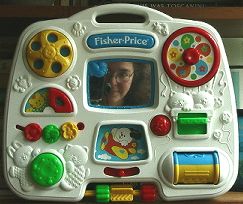
for my personality as a media designer (and as an individual). It took weeks
of puzzling to arrive at the idea of using a child's "busy-box." (Babysitting
for my young nephew proved to a source of great inspiration as we played
together with what Fisher Price officially terms its "Baby's Activity Center.")
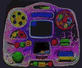
I found a Photoshop maven
to help me create the more realistic and (hopefully) much more sophisticated
adaptation of my original photograph that you see on the front end of this
web site. I eliminated unnecessary textural details (childish teddy bears
and and plastic hearts, etc.) and designed/manipulated each icon so that it
at least suggested the things it would stand for without taking it so far
from the real thing that the box would no longer be "readable" as the thing
it is. (Did some visual testing here--happily, even folks who grew up in China
recognize this thing immediately as an interactive child's busy-box, which
they, by the way, call a mang lu wan ju he.)
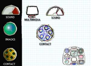
And of course I worried that two images referred to outdated artifacts: when's the last time you saw a rotary phone (CONTACT) or used a manual typewriter (WORDS)? Wearing my designer hat, I decided it was better to keep close to the original rather than update it to the uglier images of contemporary computer keyboard and keypad phone. After agonizing over typefaces (I really wanted Liberty, but finally settled on Trebuchet for some very pragmatic production-related reasons), I decided I had to redo my photo. Conceptually, I liked the idea of me looking out of the box; it also plays nicely on the classic photographer-in-the-mirror schtick. But the original image was too murky, and since I'd used my digital camera, the boxy camera shape did not immediately read as "camera lens." So I shot a substitute, rigging a complicated mirror arrangement with my digital camera placed behind me and my old Nikon as a prop only. I used a remote to control the shutter, in case you're curious. And I began the tedious process of sifting and sorting information, trying to reiterate certain themes so that even the casual browser would begin to get a sense of me and what TLC PRODUCTIONS is about. I chose to avoid frames because of the complications inherent, and, though I wanted the playfulness of the animated GIFs from the start, chose not to shockwave things at the front end because I think that immediately eliminates a certain chunk of my potential market. (You'll note that other elements that are shockwaved, like the museum prototype, are also available in alternate text/screen capture still format.) It's probably best viewed with Netscape at 600x800 on a PC, though it also works at other sizes, with Explorer, and on Macs. Turn off unneeded data lines in your browser to see full screen (in Netscape, you can go to "View" and close navigation, location and personal toolbars). Oh, yeah, coding: I started off, intrepid as ever, in Dreamweaver (great tutorial, but every time I tried to search the Help section to make it do something I couldn't find the way), then backed down to Netscape Composer (klutzy, but I've used it before). This time, I found out the hard way it eats good code. A talented young web-meister helped straighten out the problems and introduced me to HomeSite. (We don't say the word "Composer" out loud anymore, unless referring to the musical sort.) And then I wound up back in Dreamweaver, which was great for adding audio and video and making changes. Along the way I used Photoshop and Fireworks (though next time I'll use Box Top Pro, because it seems to give you faster-loading, better-quality images). Ideally, I'd like to add more sound and video, and make a whole slew of other improvements, but hey, I've got to get this thing up, you know? I'm curious to know what you think--send me an e-mail with your two-cents' worth.
You may not reproduce any portion of graphics, text, sound, or images without written permission from TLC PRODUCTIONS, 33 Twin Glens, Ithaca, New York 14850. |
|||||||||||||||||||||||||